5 ways to receive the best quality from your order:
Here’s some tips to know where the design & print common mistakes happen and how to avoid them, especially if you are sending us your own artwork to be printed.
1) Insufficient Bleed Allowance:
A common mistake in design and printing is not including enough bleed in the artwork. Bleed refers to the portion of the design that extends beyond the document’s edges.
For standard projects including business stationery, leaflets, and posters you should leave at least 3mm of bleed. For larger formats, such as banners and signage, even more bleed is recommended to accommodate the increased dimensions. This extra space ensures that minor inconsistencies in paper alignment or movement during printing and finishing won’t leave unwanted white edges on your final product.
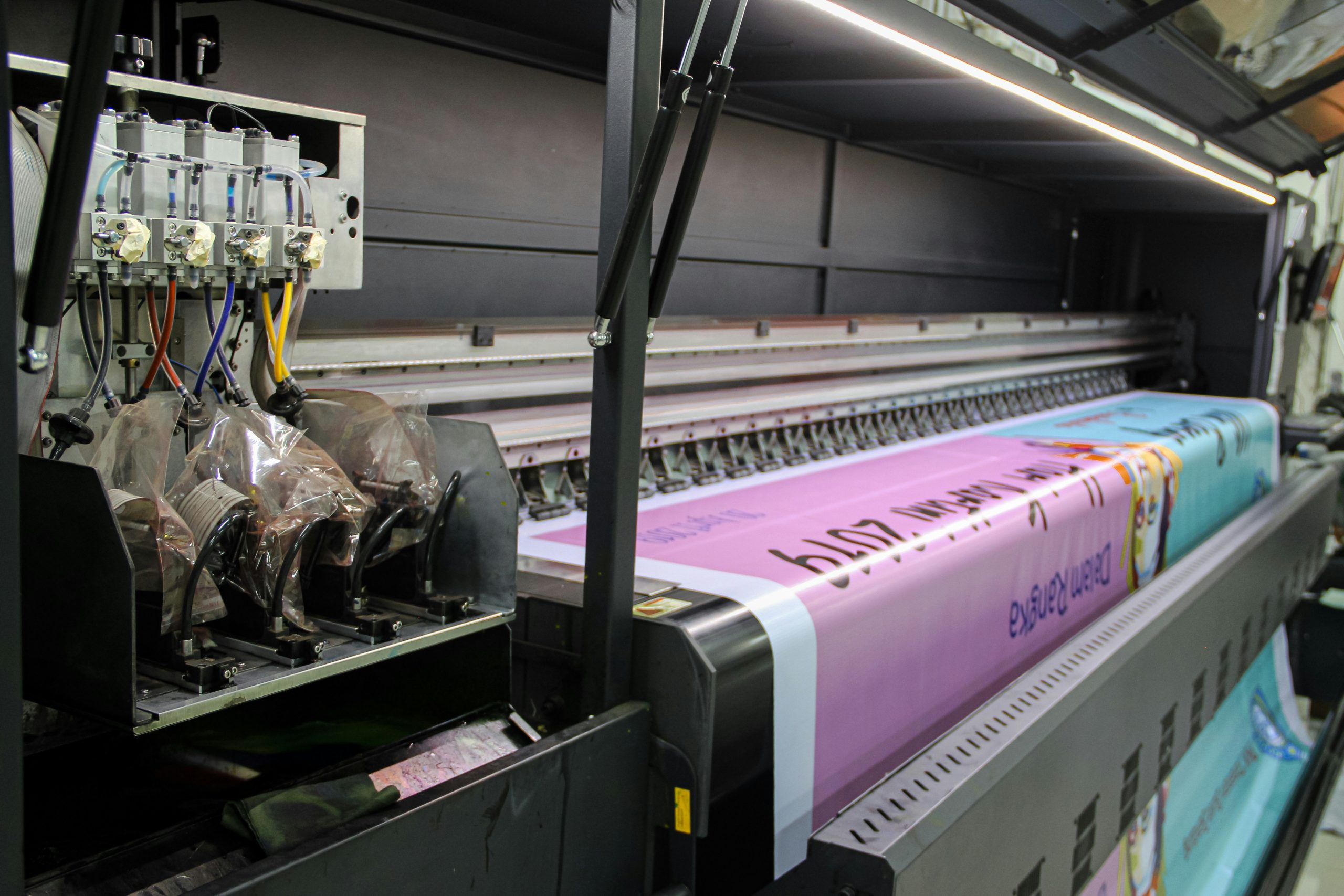
2) Using CMYK for Digital Print:
Most digital printers, including our very own Xerox Versant, use a CMYK toner system—Cyan (blue), Magenta (pink), Yellow, and Black to print your materials with a rich quality finish.
To ensure the best results, always save your files and images in a CMYK format. Most images will automatically be RGB and can be converted to CMYK easily using software such as Adobe Photoshop or similar. If your file contains both CMYK and RGB colours, even if they look identical on screen, they will appear differently when processed for print.
3) Poor Image Resolution:
Using images with low resolution is a common design and print mistake, often leading to blurry or pixelated results. For crisp, clear, high-quality images, always use a resolution of at least 300–400 ppi.
High-resolution images can be sourced from royalty-free platforms like Shutterstock or Adobe Stock or captured properly by yourself or a professional photographer. Avoid using images from Google, generic websites, or social media, as these are often downsized for quick viewing and too low in quality for printing.
4) Supplying the Wrong File Formats for Printing:
Choosing the right file format is crucial for successful printing, and it’s an area where mistakes often happen. For print projects, print-ready PDFs (with 3mm bleed and trims), InDesign, and Illustrator files are the ideal formats.
Avoid using .png and .gif files, as these formats are designed for on-screen use and don’t work well for printing. Both typically support a resolution of only 72 ppi, which is far too low for high-quality print production (as mentioned in point 3!).
5) The Use of Quiet Borders:
Failing to include quiet borders (margins) is another common design and printing mistake that can easily be avoided. Quiet borders act as buffer zones or safe areas, ensuring that no text or important elements are placed too close to the edge of your document.
These borders should be at least 5mm from the document edge. For example, design frame borders should also maintain this 5mm distance to allow for any slight inconsistencies or movement during printing and finishing. Quiet borders are especially critical for projects like wiro-bound books, calendars, or stitched booklets.
If text or images are placed too close to the edge, they risk being cut into or cut off completely by the finishing process.
Did you know?
Mutual Media offers a full creative design and artworking service for all of your marketing materials from business stationery to brochures and banners to signage.
Let us ensure your artwork is set up correctly for the printing process and taking advantage of an artwork checking service. This would highlight any issues / concerns with the artwork provided before going to print.
To find out more about our design services, please see our creative design page that can be found by clicking here.


